Chart: Create a combined chart
Example of creating combined Excel charts from two different chart types.
Image of the output file:
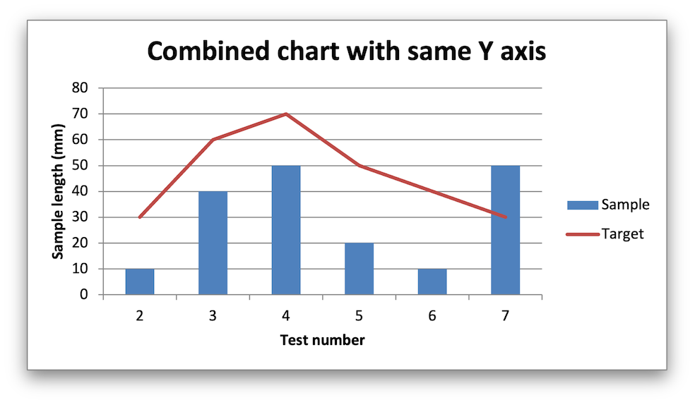
In the first example we create a combined column and line chart that share the same X and Y axes:
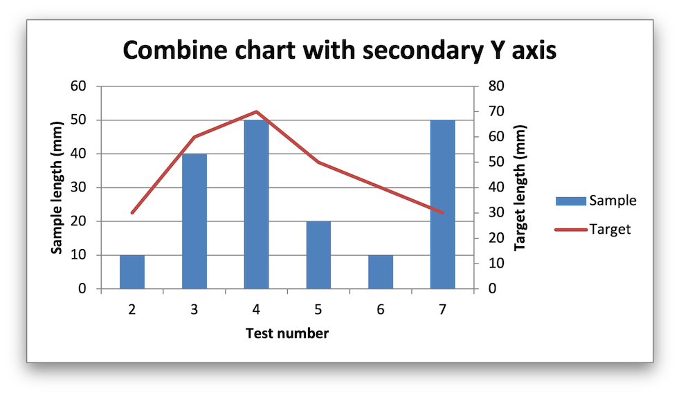
In the second example we create a similar combined column and line chart except that the secondary chart has a secondary Y axis:
Code to generate the output file:
// SPDX-License-Identifier: MIT OR Apache-2.0
//
// Copyright 2022-2026, John McNamara, jmcnamara@cpan.org

//! An example of creating combined charts using the `rust_xlsxwriter` library.

use rust_xlsxwriter::{Chart, ChartType, Format, Workbook, XlsxError};

fn main() -> Result<(), XlsxError> {
    let mut workbook = Workbook::new();
    let worksheet = workbook.add_worksheet();
    let bold = Format::new().set_bold();

    // Add the worksheet data that the charts will refer to.
    let headings = ["Number", "Sample", "Target"];
    worksheet.write_row_with_format(0, 0, headings, &bold)?;

    let data = [
        [2, 3, 4, 5, 6, 7],
        [10, 40, 50, 20, 10, 50],
        [30, 60, 70, 50, 40, 30],
    ];
    worksheet.write_column_matrix(1, 0, data)?;

    // -----------------------------------------------------------------------
    // In the first example we will create a combined column and line chart.
    // The charts will share the same X and Y axes.
    // -----------------------------------------------------------------------
    let mut column_chart = Chart::new(ChartType::Column);

    // Configure the data series for the primary chart.
    column_chart
        .add_series()
        .set_name("Sheet1!$B$1")
        .set_categories("Sheet1!$A$2:$A$7")
        .set_values("Sheet1!$B$2:$B$7");

    // Create a new line chart. This will use this as the secondary chart.
    let mut line_chart = Chart::new(ChartType::Line);

    // Configure the data series for the secondary chart.
    line_chart
        .add_series()
        .set_name("Sheet1!$C$1")
        .set_categories("Sheet1!$A$2:$A$7")
        .set_values("Sheet1!$C$2:$C$7");

    // Combine the charts.
    column_chart.combine(&line_chart);

    // Add a chart title and some axis labels. Note, this is done via the
    // primary chart.
    column_chart
        .title()
        .set_name("Combined chart with same Y axis");
    column_chart.x_axis().set_name("Test number");
    column_chart.y_axis().set_name("Sample length (mm)");

    // Add the primary chart to the worksheet.
    worksheet.insert_chart(1, 4, &column_chart)?;

    // -----------------------------------------------------------------------
    // In the second example we will create a similar combined column and line
    // chart except that the secondary chart will have a secondary Y axis.
    // -----------------------------------------------------------------------
    let mut column_chart = Chart::new(ChartType::Column);

    // Configure the data series for the primary chart.
    column_chart
        .add_series()
        .set_name("Sheet1!$B$1")
        .set_categories("Sheet1!$A$2:$A$7")
        .set_values("Sheet1!$B$2:$B$7");

    // Create a new line chart. This will use this as the secondary chart.
    let mut line_chart = Chart::new(ChartType::Line);

    // Configure the data series for the secondary chart.
    line_chart
        .add_series()
        .set_name("Sheet1!$C$1")
        .set_categories("Sheet1!$A$2:$A$7")
        .set_values("Sheet1!$C$2:$C$7")
        .set_secondary_axis(true);

    // Combine the charts.
    column_chart.combine(&line_chart);

    // Configure the data series for the secondary chart. We also set a
    // secondary Y axis via (y2_axis). This is the only difference between
    // this and the first example, apart from the axis label below.
    column_chart
        .title()
        .set_name("Combine chart with secondary Y axis");
    column_chart.x_axis().set_name("Test number");
    column_chart.y_axis().set_name("Sample length (mm)");

    // Note: the y2 properties are set via the primary chart.
    column_chart.y2_axis().set_name("Target length (mm)");

    // Add the primary chart to the worksheet.
    worksheet.insert_chart(17, 4, &column_chart)?;

    // Save the file to disk.
    workbook.save("chart_combined.xlsx")?;

    Ok(())
}