Chart: Create a combined pareto chart
Example of creating a Pareto chart with a secondary chart and axis.
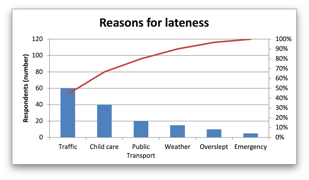
A Pareto chart is a type of chart that combines a Column/Histogram chart and a Chart. Individual values are represented in descending order by the columns and the cumulative total is represented by the line approaching 100% on a second axis.
Image of the output file:
Code to generate the output file:
// SPDX-License-Identifier: MIT OR Apache-2.0
//
// Copyright 2022-2026, John McNamara, jmcnamara@cpan.org

//! An example of creating a Pareto chart using the `rust_xlsxwriter` library.

use rust_xlsxwriter::{Chart, ChartType, Format, Workbook, XlsxError};

fn main() -> Result<(), XlsxError> {
    let mut workbook = Workbook::new();
    let worksheet = workbook.add_worksheet();

    // Formats used in the workbook.
    let bold = Format::new().set_bold();
    let percent_format = Format::new().set_num_format("0%");

    // Add the worksheet data that the charts will refer to.
    let headings = ["Reason", "Number", "Percentage"];

    let reasons = [
        "Traffic",
        "Child care",
        "Public Transport",
        "Weather",
        "Overslept",
        "Emergency",
    ];

    let numbers = [60, 40, 20, 15, 10, 5];
    let percents = [0.440, 0.667, 0.800, 0.900, 0.967, 1.00];

    worksheet.write_row_with_format(0, 0, headings, &bold)?;
    worksheet.write_column(1, 0, reasons)?;
    worksheet.write_column(1, 1, numbers)?;
    worksheet.write_column_with_format(1, 2, percents, &percent_format)?;

    // Widen the columns for visibility.
    worksheet.set_column_width(0, 15)?;
    worksheet.set_column_width(1, 10)?;
    worksheet.set_column_width(2, 10)?;

    //
    // Create a new Column chart. This will be the primary chart.
    //
    let mut column_chart = Chart::new(ChartType::Column);

    // Configure a series on the primary axis.
    column_chart
        .add_series()
        .set_categories("Sheet1!$A$2:$A$7")
        .set_values("Sheet1!$B$2:$B$7");

    // Add a chart title.
    column_chart.title().set_name("Reasons for lateness");

    // Turn off the chart legend.
    column_chart.legend().set_hidden();

    // Set the  name and scale of the Y axes. Note, the secondary axis is set
    // from the primary chart.
    column_chart
        .y_axis()
        .set_name("Respondents (number)")
        .set_min(0)
        .set_max(120);

    column_chart.y2_axis().set_max(1);

    //
    // Create a new Line chart. This will be the secondary chart.
    //
    let mut line_chart = Chart::new(ChartType::Line);

    // Add a series on the secondary axis.
    line_chart
        .add_series()
        .set_categories("Sheet1!$A$2:$A$7")
        .set_values("Sheet1!$C$2:$C$7")
        .set_secondary_axis(true);

    // Combine the charts.
    column_chart.combine(&line_chart);

    // Add the chart to the worksheet.
    worksheet.insert_chart(1, 5, &column_chart)?;

    workbook.save("chart_pareto.xlsx")?;

    Ok(())
}