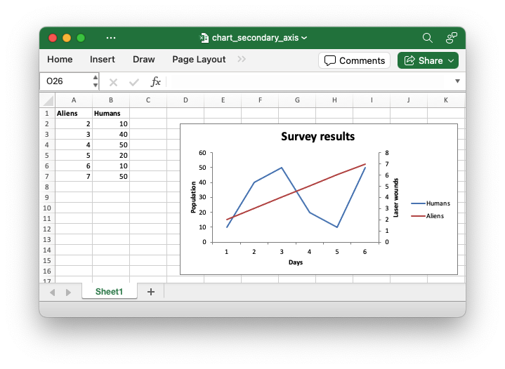
Chart: Using a secondary axis
Example of creating an Excel Line chart with a secondary axis by setting the
ChartSeries::set_secondary_axis() property for one of more series in the
chart.
Image of the output file:
Code to generate the output file:
// SPDX-License-Identifier: MIT OR Apache-2.0
//
// Copyright 2022-2026, John McNamara, jmcnamara@cpan.org
//! An example of creating an Excel Line chart with a secondary axis using the
//! `rust_xlsxwriter` library.
use rust_xlsxwriter::{Chart, ChartType, Format, Workbook, XlsxError};
fn main() -> Result<(), XlsxError> {
let mut workbook = Workbook::new();
let worksheet = workbook.add_worksheet();
let bold = Format::new().set_bold();
// Add the worksheet data that the charts will refer to.
worksheet.write_with_format(0, 0, "Aliens", &bold)?;
worksheet.write_with_format(0, 1, "Humans", &bold)?;
worksheet.write_column(1, 0, [2, 3, 4, 5, 6, 7])?;
worksheet.write_column(1, 1, [10, 40, 50, 20, 10, 50])?;
// Create a new line chart.
let mut chart = Chart::new(ChartType::Line);
// Configure a series with a secondary axis.
chart
.add_series()
.set_name("Sheet1!$A$1")
.set_values("Sheet1!$A$2:$A$7")
.set_secondary_axis(true);
// Configure another series that defaults to the primary axis.
chart
.add_series()
.set_name("Sheet1!$B$1")
.set_values("Sheet1!$B$2:$B$7");
// Add a chart title and some axis labels.
chart.title().set_name("Survey results");
chart.x_axis().set_name("Days");
chart.y_axis().set_name("Population");
chart.y2_axis().set_name("Laser wounds");
chart.y_axis().set_major_gridlines(false);
// Add the chart to the worksheet.
worksheet.insert_chart_with_offset(1, 3, &chart, 25, 10)?;
workbook.save("chart_secondary_axis.xlsx")?;
Ok(())
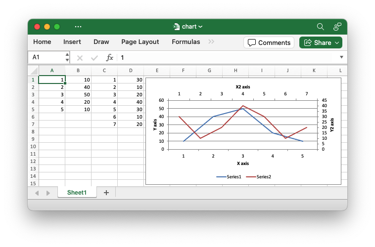
}In general secondary axes are used for displaying different Y values for the same category range. However it is also possible to display a secondary X axis for series that use a different category range. See the example below.
Image of the output file:
Code to generate the output file:
// SPDX-License-Identifier: MIT OR Apache-2.0
//
// Copyright 2022-2026, John McNamara, jmcnamara@cpan.org

//! A chart example demonstrating using a secondary X and Y axis. The secondary
//! X axis is only available for chart series that have a category range that is
//! different from the primary category range.

use rust_xlsxwriter::{
    Chart, ChartAxisCrossing, ChartAxisLabelPosition, ChartLegendPosition, ChartType, Workbook,
    XlsxError,
};

fn main() -> Result<(), XlsxError> {
    let mut workbook = Workbook::new();
    let worksheet = workbook.add_worksheet();

    // Add the worksheet data that the charts will refer to.
    worksheet.write_column(0, 0, [1, 2, 3, 4, 5])?;
    worksheet.write_column(0, 1, [10, 40, 50, 20, 10])?;
    worksheet.write_column(0, 2, [1, 2, 3, 4, 5, 6, 7])?;
    worksheet.write_column(0, 3, [30, 10, 20, 40, 30, 10, 20])?;

    // Create a new line chart.
    let mut chart = Chart::new(ChartType::Line);

    // Configure a series that defaults to the primary axis.
    chart
        .add_series()
        .set_categories(("Sheet1", 0, 0, 4, 0))
        .set_values(("Sheet1", 0, 1, 4, 1));

    // Configure another series with a secondary axis. Note that the category
    // range is different to the primary axes series.
    chart
        .add_series()
        .set_categories(("Sheet1", 0, 2, 6, 2))
        .set_values(("Sheet1", 0, 3, 6, 3))
        .set_secondary_axis(true);

    // Make the secondary X axis visible (it is hidden by default) and also
    // position the labels so they are next to the axis and therefore visible.
    chart
        .x2_axis()
        .set_hidden(false)
        .set_label_position(ChartAxisLabelPosition::NextTo);

    // Set the X2 axis to cross the Y2 axis at the max value so it appears at
    // the top of the chart.
    chart.y2_axis().set_crossing(ChartAxisCrossing::Max);

    // Add some axis labels.
    chart.x_axis().set_name("X axis");
    chart.y_axis().set_name("Y axis");
    chart.x2_axis().set_name("X2 axis");
    chart.y2_axis().set_name("Y2 axis");

    // Move the legend to the bottom for clarity.
    chart.legend().set_position(ChartLegendPosition::Bottom);

    // Add the chart to the worksheet.
    worksheet.insert_chart_with_offset(0, 4, &chart, 5, 5)?;

    workbook.save("chart.xlsx")?;

    Ok(())
}