Chart: Gauge Chart
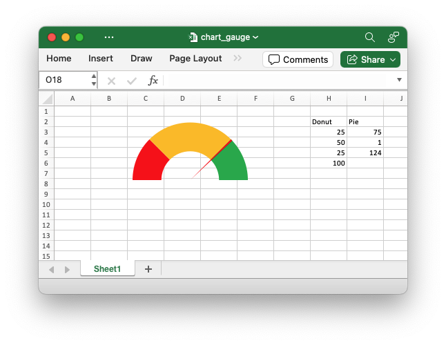
A Gauge Chart isn't a native chart type in Excel. It is constructed by combining a doughnut chart and a pie chart and by using some non-filled elements to hide parts of the default charts. This example follows the following online example of how to create a Gauge Chart in Excel.
Image of the output file:
Code to generate the output file:
// SPDX-License-Identifier: MIT OR Apache-2.0
//
// Copyright 2022-2026, John McNamara, jmcnamara@cpan.org

//! An example of creating a Gauge Chart in Excel using the `rust_xlsxwriter`
//! library.
//!
//! A Gauge Chart isn't a native chart type in Excel. It is constructed by
//! combining a doughnut chart and a pie chart and by using some non-filled
//! elements to hide parts of the default charts. This example follows the
//! following online example of how to create a [Gauge Chart] in Excel.
//!
//! [Gauge Chart]: https://www.excel-easy.com/examples/gauge-chart.html
//!

use rust_xlsxwriter::{
    Chart, ChartFormat, ChartPoint, ChartSolidFill, ChartType, Workbook, XlsxError,
};

fn main() -> Result<(), XlsxError> {
    let mut workbook = Workbook::new();

    let worksheet = workbook.add_worksheet();

    // Add some data for the Doughnut and Pie charts. This is set up so the
    // gauge goes from 0-100. It is initially set at 75%.
    worksheet.write(1, 7, "Donut")?;
    worksheet.write(1, 8, "Pie")?;
    worksheet.write_column(2, 7, [25, 50, 25, 100])?;
    worksheet.write_column(2, 8, [75, 1, 124])?;

    // Configure the doughnut chart as the background for the gauge. We add some
    // custom colors for the Red-Orange-Green of the dial and one non-filled segment.
    let mut chart_doughnut = Chart::new(ChartType::Doughnut);

    let points = vec![
        ChartPoint::new().set_format(
            ChartFormat::new().set_solid_fill(ChartSolidFill::new().set_color("#FF0000")),
        ),
        ChartPoint::new().set_format(
            ChartFormat::new().set_solid_fill(ChartSolidFill::new().set_color("#FFC000")),
        ),
        ChartPoint::new().set_format(
            ChartFormat::new().set_solid_fill(ChartSolidFill::new().set_color("#00B050")),
        ),
        ChartPoint::new().set_format(ChartFormat::new().set_no_fill()),
    ];

    // Add the chart series.
    chart_doughnut
        .add_series()
        .set_values(("Sheet1", 2, 7, 5, 7))
        .set_name(("Sheet1", 1, 7))
        .set_points(&points);

    // Turn off the chart legend.
    chart_doughnut.legend().set_hidden();

    // Rotate chart so the gauge parts are above the horizontal.
    chart_doughnut.set_rotation(270);

    // Turn off the chart fill and border.
    chart_doughnut
        .chart_area()
        .set_format(ChartFormat::new().set_no_fill().set_no_border());

    // Configure a pie chart as the needle for the gauge.
    let mut chart_pie = Chart::new(ChartType::Pie);
    let points = vec![
        ChartPoint::new().set_format(ChartFormat::new().set_no_fill()),
        ChartPoint::new().set_format(
            ChartFormat::new().set_solid_fill(ChartSolidFill::new().set_color("#FF0000")),
        ),
        ChartPoint::new().set_format(ChartFormat::new().set_no_fill()),
    ];

    // Add the chart series.
    chart_pie
        .add_series()
        .set_values(("Sheet1", 2, 8, 5, 8))
        .set_name(("Sheet1", 1, 8))
        .set_points(&points);

    // Rotate the pie chart/needle to align with the doughnut/gauge.
    chart_pie.set_rotation(270);

    // Combine the pie and doughnut charts.
    chart_doughnut.combine(&chart_pie);

    // Insert the chart into the worksheet.
    worksheet.insert_chart(0, 0, &chart_doughnut)?;

    workbook.save("chart_gauge.xlsx")?;

    Ok(())
}